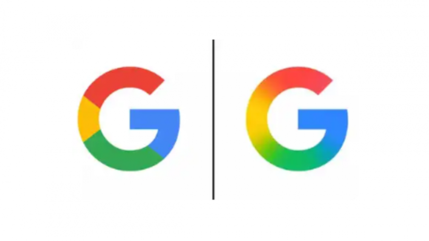
In a subtle yet meaningful shift, Google has unveiled a redesigned version of its iconic ‘G’ logo, marking the first major visual update in nearly ten years. The updated design moves away from the traditional segmented colour format and embraces a smooth, multicoloured gradient that blends Google’s signature red, yellow, green, and blue hues into a seamless swirl.
This refined look echoes the aesthetic introduced in recent branding for Google’s AI products, including Gemini and the AI Mode in Search. The gradient design reflects the company’s broader push toward a unified and modern visual identity across its suite of services.
The redesigned ‘G’ has already begun appearing on the Google app for iOS devices and on Pixel phones, following the rollout of version 16.18 (beta) of the Google Search app on Android. However, the classic segmented ‘G’ remains in place on other Android devices and web platforms, indicating a phased rollout rather than an immediate global switch.
Google has not yet made a formal announcement regarding the change or its wider implementation across all platforms. Nonetheless, the update suggests that other icons, such as those for Chrome, Maps, and additional Google services, could soon receive similar treatment to maintain consistency across the brand’s visual ecosystem.
This is the first major change to Google’s logo since September 2015, when the tech giant introduced a flatter, sans-serif typeface and a more modern look for its full six-letter wordmark. That update also introduced the now-familiar standalone ‘G’ composed of four distinct colour segments.
Much like the redesign of the Google Play logo on its 10th anniversary, this update comes nearly a decade after the last logo revamp, marking a pattern in Google’s approach to visual evolution.